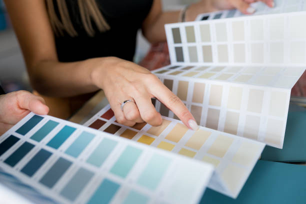
Close-up of two women choosing samples of wall paint. Interior designer consulting a client looking at a color swatch. House renovation concept
Walk into a room painted a deep forest green and your shoulders drop a little. Walk into one painted bright yellow and you feel more alert, sometimes pleasantly, sometimes not. Most people notice these reactions without ever asking why they happen, and yet the answer sits behind one of the most consequential decisions in any renovation: what colour to put on the walls. Colour is not decoration layered on top of a room; it is part of the room’s function, shaping how people rest, work, eat, and gather inside it. This is precisely why professional colour consultations exist as a service in their own right, separate from the painting itself, because choosing colour well requires thinking about human behaviour first and paint chips second.
The science behind these reactions is a genuinely interesting mix of biology, culture, and learned association. Some responses appear to be close to universal: long wavelength colours like red and orange measurably raise arousal and can even nudge heart rate and appetite, while short wavelength colours like blue and green are consistently associated with calm and lowered stress in study after study. Other responses are cultural or personal, built from decades of association, which is why the same grey that reads as sophisticated to one person reads as gloomy to another. A useful overview of what researchers have actually established, versus what is decorating folklore, is available through Verywell Mind’s summary of colour psychology research (verywellmind.com). The honest scientific position is that colour effects are real but moderate, and they interact heavily with light, context, and the person. That is exactly why applying them room by room, rather than following one size fits all rules, produces homes that genuinely feel better to live in.
Bedrooms: Engineering for Rest
The bedroom is where colour psychology earns its keep most clearly, because the room has a single dominant job: helping your nervous system wind down. Cool, muted colours consistently support that job. Soft blues, sage and eucalyptus greens, gentle grey greens, and warm restrained neutrals lower visual stimulation and signal rest. Survey data from sleep researchers has repeatedly found that people sleeping in blue toned bedrooms report longer and better quality sleep than those in bright or high energy colours, and while the effect size is debated, the direction is not. The colours that fight against sleep are the saturated, high arousal ones: vivid reds, electric oranges, and intense purples keep the visual system engaged when you want it powering down. If you love bold colour, the bedroom compatible way to use it is in accents you do not face from the pillow, like the wall behind the headboard, so the colour is present in the room without being the last thing your brain processes at night.
Kitchens and Dining Areas: Appetite and Energy
Warm colours and food have a long, well documented relationship, which is why so many restaurants lean on reds, terracottas, and warm yellows. In a home kitchen, warmth translates into energy and sociability: soft yellows and creams make morning light feel brighter, warm whites keep the space feeling clean without going clinical, and earthy terracottas or brick tones give a kitchen the gathered, convivial quality people associate with cooking together. Dining rooms can go deeper and moodier, since deep warm tones like oxblood, aubergine, and rich caramel flatter both food and faces in evening light. The colours to handle carefully around food are the cold blue greys and stark blues, which have historically been linked with appetite suppression; they can absolutely work in a modern kitchen, but they generally need warm wood, brass, or warm lighting to counterbalance the chill.
Living Rooms: The Balancing Act
The living room is the hardest room to colour well because it hosts contradictory activities: energetic family time, quiet reading, entertaining, television in the dark, and everything between. The reliable strategy is to choose a grounded, medium temperature base, like warm greige, mushroom, soft olive, or muted terracotta, and let furnishings and art carry the stronger personality. These middle tones flex with the room’s changing uses in a way that strongly committed colours cannot. Deep, enveloping colours such as navy or charcoal green can be spectacular in living rooms, but they behave best in rooms with generous natural light or in homes where evenings are the room’s main act, because dark walls after sunset create intimacy in a large room and claustrophobia in a small one.
Home Offices and Small Spaces
For focused work, mid tone greens and blue greens have the best track record, offering enough visual interest to avoid sterility while keeping arousal low enough for concentration; pure white offices, despite their popularity in photographs, are associated in workplace research with more eye strain and restlessness than softly coloured ones. In small rooms and hallways, the psychology intersects with optics: light, low contrast schemes visually expand the space, while wrapping a genuinely tiny room, like a powder room, in one deep dramatic colour can make it feel intentional rather than cramped. The common thread in every room is that colour should be chosen for how the room is used and lit, not for how a chip looks in a store. Test large samples on multiple walls, live with them through morning and evening light, and if the stakes or the square footage are high, an hour with a colour consultant who works with these principles daily costs a fraction of repainting a wrong decision.
Frequently Asked Questions
Do paint colours really affect mood, or is it a myth?
The effects are real but moderate. Research consistently shows warm saturated colours raise arousal and cool muted colours lower it, while many specific associations are personal or cultural. Colour will not transform your life, but it reliably nudges how restful, energetic, or focused a room feels, which is worth designing for.
What is the best colour for sleep?
Soft, muted cool tones lead the field: gentle blues, sage greens, and calm warm neutrals. The principle matters more than the exact shade; low saturation and low contrast help the room read as restful. Avoid vivid reds, oranges, and bright purples as the dominant bedroom colour.
Are dark colours a bad idea in small rooms?
Not automatically. Light colours maximize the sense of space, but a small room fully wrapped in a deep colour can feel deliberately cozy and dramatic rather than cramped. The failure mode is hesitation: one dark accent wall in a tiny bright room often just makes the room feel smaller and unfinished.
How do I test whether a colour will work in my room?
Paint large swatches, at least half a metre square, on two or three different walls, and observe them across a full day and under evening lighting. Colours shift dramatically with light direction and bulb temperature, and a chip in a store tells you almost nothing about how the colour will behave in your specific room.