Product Packaging Design for Better Brand Recognition
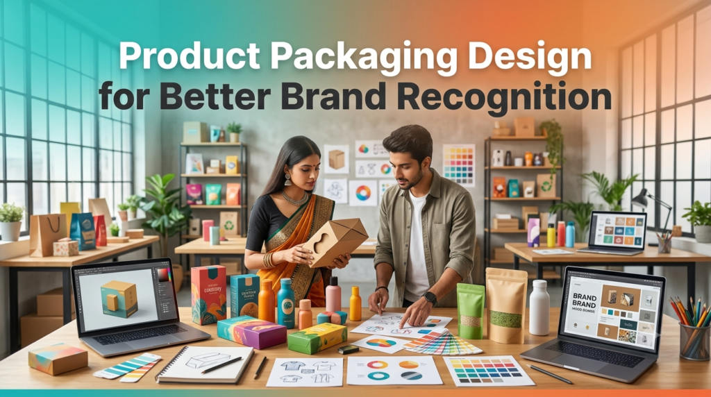
Have you ever picked up a product simply because the packaging caught your eye? I have. Sometimes it’s a coffee bag with a simple matte finish. Other times it’s a skincare bottle that somehow feels expensive before you’ve even opened it. That’s the strange thing about product packaging design—it starts shaping your opinion long before the product gets a chance to speak for itself.
People often think branding begins with a logo. It doesn’t always. Packaging is usually the first real interaction someone has with a brand. It’s sitting on a shelf, arriving in a delivery box, or appearing in a social media post. Those first few seconds matter more than most businesses expect.
Why Packaging Leaves a Lasting Impression
Walk through any supermarket for five minutes.
There are hundreds of products competing for attention.
Some disappear into the background.
Others seem impossible to ignore.

The difference isn’t always a bigger marketing budget. Often it’s thoughtful brand packaging design that makes people pause.
Colors, shapes, textures, and typography work together to create familiarity. After seeing the same packaging a few times, customers begin recognizing the brand almost automatically.
It’s a little like recognizing someone’s handwriting.
Your Packaging Tells a Story
Every design choice sends a message.
A brown recycled box suggests sustainability.
A glossy black package feels more premium.
Bright colors usually create energy.
Muted tones can feel calm.
None of these choices exist by accident.
Good product packaging design matches the personality of the brand without becoming overly complicated. Customers shouldn’t have to guess what the product is trying to be.
Clarity usually wins.
Color Is Doing More Work Than You Think
Color tends to grab attention before people read a single word.

Some become recognizable almost entirely because of their color palette.
Picking colors isn’t about choosing favorites. It’s about creating consistency across every package, label, and marketing material.
A few common associations include:
-
Green for natural or eco-friendly products
-
Blue for trust and cleanliness
-
Black for luxury
-
Yellow for energy
-
White for simplicity
Of course, these aren’t strict rules. Sometimes breaking expectations creates memorable packaging too.
Typography Shapes First Impressions
Fonts quietly influence how people feel.
A bold sans-serif font creates one impression.
A handwritten script creates another.
The important part is readability.
Nobody wants to squint at tiny product information or struggle to read the brand name from a distance.
I’ve noticed that many successful brands keep their typography surprisingly simple. Fancy doesn’t always help.
Packaging Should Feel Good in Your Hands

This part gets overlooked.
Touch matters.
A soft-touch finish feels different from glossy plastic.
Embossed logos create a subtle premium feeling.
Even the sound of opening a sturdy box can leave an impression.
Small sensory details make the experience feel more memorable without saying a word.
People remember experiences more than specifications.
Simple Usually Beats Busy
Some packages try to include everything.
Five colors.
Ten fonts.
Too many icons.
The result feels crowded.
A cleaner layout gives each element room to breathe. The brand name becomes easier to notice, product information becomes clearer, and customers make decisions faster.
Sometimes removing one unnecessary element improves the entire design.
Funny how that works.
Packaging for Online Shopping Matters Too
Years ago, packaging mostly competed on store shelves.
Now it competes on phone screens.

People discover products through Instagram, LinkedIn, YouTube, and online stores before seeing them in person.
That changes things.
Ecommerce packaging design needs to look good in photos, survive shipping, and create an enjoyable unboxing experience.
Customers often share attractive packaging online.
That’s free visibility many businesses never planned for.
Sustainable Packaging Is Becoming More Noticeable
More customers pay attention to packaging waste than they did a few years ago.
Not everyone makes buying decisions based on sustainability.
Many do.
Using recyclable materials, reducing unnecessary plastic, and keeping packaging practical can improve how people view the brand.
The packaging doesn’t need to become completely plain.
It just needs to feel thoughtful.
There’s a difference.
Small Brands Can Still Stand Out
One common misconception is that memorable packaging requires a huge budget.
Not really.

A small candle business can stand out with a clean label.
A handmade soap brand can become recognizable through consistent colors.
A local coffee roaster can use simple kraft paper with a distinctive logo.
Consistency matters more than expensive materials in many cases.
People remember patterns.
Common Packaging Mistakes
Even good products lose attention because of avoidable design problems.
A few mistakes appear repeatedly:
-
cluttered layouts
-
inconsistent branding
-
unreadable fonts
-
weak color contrast
-
oversized logos with tiny product names
-
confusing product information
-
poor-quality printing
None of these seem dramatic alone.
Together, they can make a product look less trustworthy.
Long-Tail Packaging Keywords That Matter Naturally
Businesses searching for packaging ideas often look for practical solutions rather than design theory.
Natural keyword phrases include:
-
product packaging design
-
packaging design for small business
-
custom product packaging
-
packaging design services
-
creative packaging ideas
-
ecommerce packaging design
-
luxury product packaging
-
sustainable packaging design
-
packaging design for branding
These fit naturally into content because they’re phrases people actually search for while planning a product launch or refreshing existing packaging.
Packaging Should Match the Product
One thing I’ve always found interesting is how disappointing mismatched packaging feels.
Imagine buying premium chocolates wrapped in flimsy plastic.
Or ordering handmade jewelry that arrives in an oversized plain box with no identity at all.
The product and packaging should feel connected.
That doesn’t mean every package needs expensive materials. A simple, well-designed label can create a stronger impression than flashy packaging that doesn’t fit the brand’s personality.
Customers notice those little details, even if they don’t consciously think about them.
Keep It Consistent Everywhere
Packaging isn’t working alone anymore.
People might first see your product on Instagram, later visit your website, then finally receive the package at their doorstep.
The colors should feel familiar.
The typography should match.
The logo should stay consistent.
Those repeated visual cues help people remember your brand without much effort.
Over time, that’s what strong product packaging design really builds—not just attractive boxes or labels, but recognition that sticks in people’s minds. Sometimes all it takes is one glance at a shelf or one delivery arriving at the front door for someone to think, “Oh yeah, I know this brand.”