Packaging can look simple when it is sitting on a dispensary shelf. A box, a label, maybe a pouch with some bold artwork on it. But getting there is rarely that simple. Good product packaging design starts long before anyone is printing boxes or sticking labels onto jars. There are rules to consider, the product itself, the brand personality, customer expectations, and the very real need to make sure everything works once it leaves the design screen. Cannabis packaging has even more moving parts because the product sits in a heavily regulated market where appearance and compliance have to work together. That can make the creative process a little tricky, but honestly, that is also what makes it interesting.
It Starts With the Brand, Not the Box
Before designers start drawing dielines or choosing fonts, there needs to be a clear idea of what the brand actually wants to say. Is it premium and minimal, playful and colorful, natural and earthy, or something completely different? Cannabis brands can easily blend together if they chase the same visual trends. Green leaves, muted colors, fancy serif fonts. You’ve seen it before. The better approach is to figure out what makes the product different and build the packaging around that. The package should feel like it belongs to the brand, not like somebody grabbed a template and changed the logo. That early thinking becomes the foundation for everything that follows, from colors and materials to photography, illustrations and the little details customers might notice only after picking the product up.
Design Has to Work Within Real Restrictions
This is where cannabis packaging gets more complicated. Designers aren’t working with a completely open canvas. Depending on the market, packaging may need specific warnings, labeling information, child-resistant features, product details and other required elements. Those requirements can take up valuable space, which means creative decisions have to happen around them. A good designer doesn’t treat compliance like something to worry about at the very end. It needs to be part of the process from the beginning. Otherwise, you can end up with a beautiful concept that has to be pulled apart later because the required information simply doesn’t fit. Not fun. Planning early saves a lot of time, money, and unnecessary redesign work.
Turning the Idea Into a Physical Package
Once the creative direction is settled, the concept has to become something physical. A designer might begin with sketches, digital mockups and structural drawings before moving toward an actual prototype. This is the point where things that looked perfectly fine on a computer can suddenly look awkward in real life. Maybe the logo disappears around a fold. Maybe the text is too small. Maybe the box doesn’t feel substantial enough when someone holds it. Packaging isn’t just a flat graphic. It has shape, weight, texture and function. Materials matter too. Glass, paperboard, flexible pouches and other formats all create different experiences. The final design needs to survive production, shipping and everyday handling, not just look good in a presentation.
Color, Typography and Shelf Recognition
There is a practical reason designers spend so much time arguing over fonts and colors. Customers often see a product from several feet away before they ever pick it up. Packaging needs enough visual identity to catch attention without becoming a noisy mess. Typography has to remain readable, especially when required information is packed into a limited area. Color can help create recognition across an entire product line, while small illustrations or graphic elements can give individual products their own personality. The trick is knowing when to stop. More graphics don’t automatically make packaging better. Sometimes a cleaner design has more impact because the important information isn’t fighting for attention with twelve other things.
Prototypes Reveal What the Screen Can’t
A digital mockup can only tell you so much. Physical samples are where the design starts proving itself. Designers and brand teams can hold the package, open it, turn it around and see how everything actually behaves. This stage often exposes small problems that weren’t obvious earlier. A lid might be annoying to remove. A printed color might look different on the chosen material. A label could wrinkle around a curved surface. None of these issues are glamorous, but they matter. The prototype stage is also where the packaging can be compared against other products in a real retail environment. A package that looks impressive alone might disappear completely when placed beside ten competing products.
Where Displays Become Part of the Experience
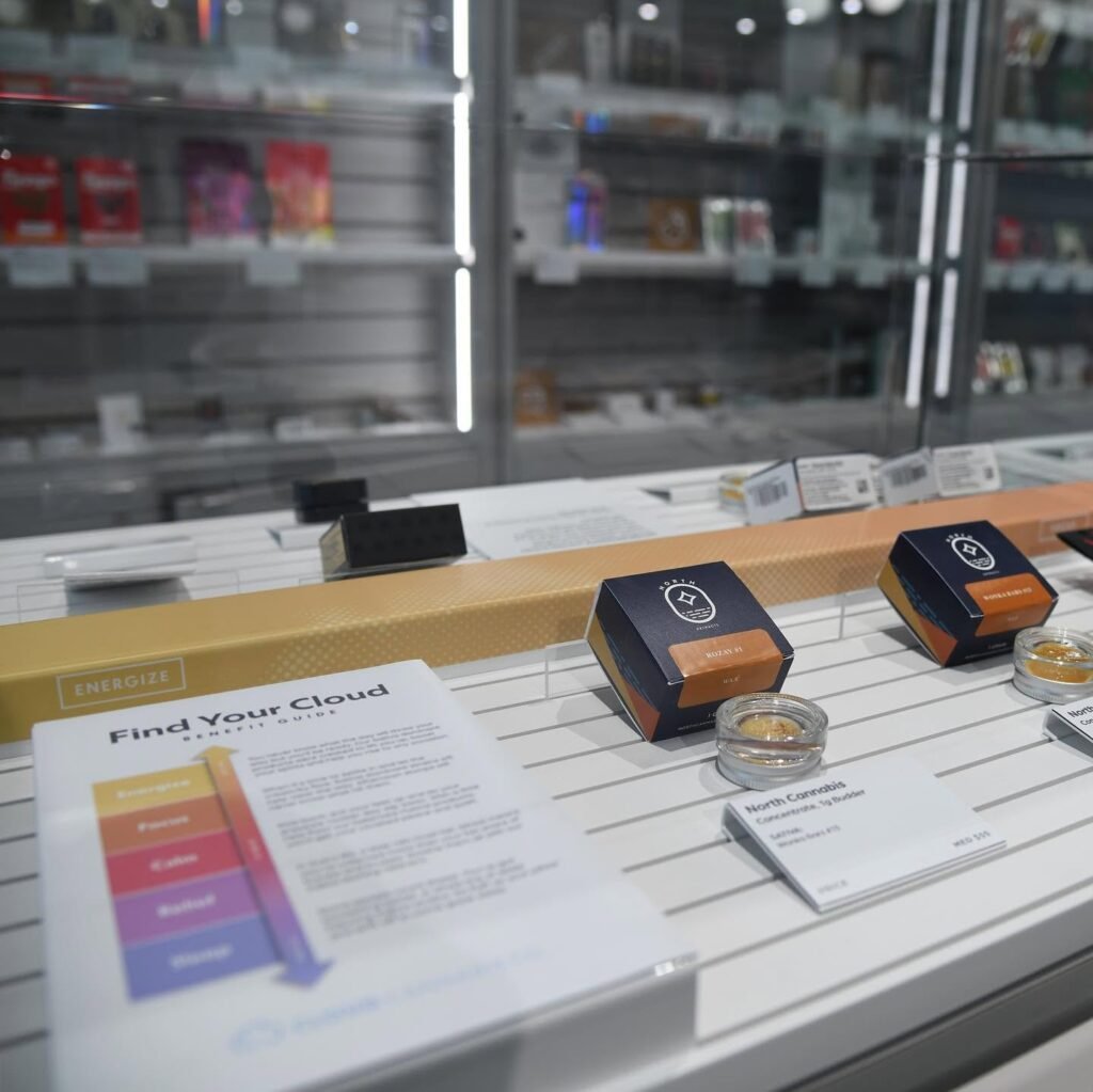
Packaging doesn’t always work by itself. In a dispensary, the surrounding retail environment can change how customers notice and understand a product. This is where custom retail displays for dispensaries can become part of the wider design conversation. Displays can reinforce the same colors, graphics and messaging used on the package, helping create a more connected brand experience. A well-designed display can also make products easier to browse without making the space feel cluttered. The important thing is consistency. If the package says one thing visually and the display feels like it belongs to a completely different company, the connection gets lost. Good retail presentation should feel like an extension of the package, not an afterthought.
From Final Files to the Production Floor
Once the design has been tested and approved, the project moves into production. Final artwork is prepared for printing, materials are confirmed, specifications are checked and samples may go through another round of approval. This part can feel less creative, but mistakes here can be expensive. A wrong color profile, missing detail or incorrect measurement can affect hundreds or thousands of finished units. Communication between designers, printers, manufacturers and the brand matters a lot at this stage. Everyone needs the same version of the design and a clear understanding of what is being produced. It sounds obvious, but packaging projects can get messy quickly when people work from outdated files or assumptions.
The Package Finally Reaches the Shelf
When the finished product finally lands on a dispensary shelf, the process behind it is mostly invisible. Customers aren’t thinking about dielines, prototypes or production specifications. They are deciding whether the product catches their eye, whether the information makes sense and whether the package feels trustworthy. That’s the real job of cannabis packaging. It has to protect the product, communicate important information, represent the brand and still make sense in a busy retail environment. Getting all of those pieces right takes more than attractive artwork. It takes planning, testing and a willingness to fix things when the first idea doesn’t quite work.
Conclusion: Good Packaging Is Built, Not Just Designed
The journey from concept to shelf is a lot longer than it looks. Cannabis packaging has to bring creative thinking together with structure, regulations, materials, manufacturing and retail presentation. Sometimes the smallest detail causes the biggest headache, and sometimes a simple design ends up being the one that works best. That is why the strongest packaging isn’t necessarily the flashiest. It is the packaging that makes sense from every angle, from the designer’s screen to the customer’s hands. When those pieces come together properly, the final package feels effortless. And that’s usually a sign that a lot of work happened behind the scenes.