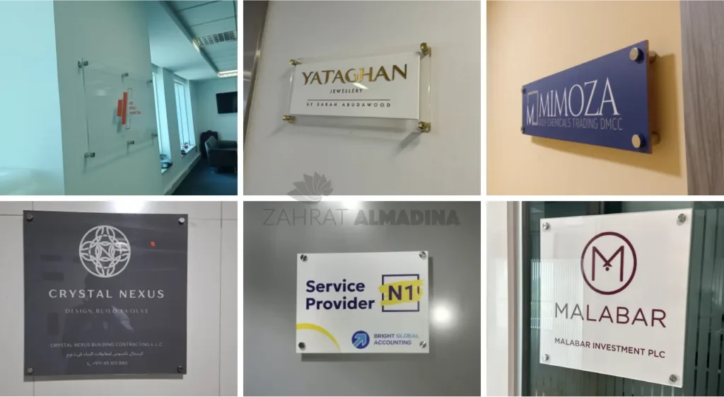
A well-designed sign helps people recognise a business, understand information, and find their way around a building. Its material, shape, colour, and lettering all influence how clearly it communicates. Acrylic signage board design is widely used in offices, retail shops, hotels, clinics, and commercial buildings because acrylic offers flexibility in appearance and can be produced in different colours, thicknesses, and finishes. When planned carefully, it can provide clear identification while complementing the surrounding interior or exterior.
Acrylic signs are not limited to displaying business names. They can also show department details, room numbers, reception information, directional instructions, logos, and promotional messages. Their final appearance depends on how the material is cut, printed, layered, mounted, and finished. Understanding these choices helps businesses select a sign that suits its purpose rather than focusing only on appearance.
1. Why Acrylic Signage Board Design Is Popular for Business Use
Acrylic is a versatile material with a smooth surface and a clean appearance. It is available in transparent, translucent, frosted, and solid-colour options. This variety makes it suitable for many types of business displays.
One reason businesses choose acrylic is its ability to support different design approaches. A simple flat board can display printed information, while cut-out letters and layered panels can create a raised appearance. The material can also be combined with metal, wood, or other surfaces.
A suitable choice for modern interiors
Reception areas often use signs to display company names and logos behind the front desk. A carefully designed acrylic panel can make this information easy to see without taking up much space.
For example, a small consultancy office might install clear acrylic with dark lettering on a light-coloured wall. A larger company could use coloured acrylic letters mounted individually to create a more prominent display.
Flexible options for different businesses
Acrylic signs are used by many types of organisations:
- Retail shops displaying business names and product information.
- Clinics identifying reception desks and consultation rooms.
- Offices displaying company logos and department names.
- Hotels providing room identification and visitor information.
- Restaurants showing menus, counter details, and directional instructions.
- Educational institutions identifying classrooms and facilities.
The design should reflect the purpose of the sign. A room number needs to be easy to read, while a reception display may also need to complement the interior decoration.
2. Understanding Acrylic Types and Their Visual Effects
The type of acrylic selected has a direct effect on the finished sign. Different surfaces allow different levels of light transmission and create distinct visual styles.
Clear acrylic
Clear acrylic allows light to pass through and has a glass-like appearance. It is often used for reception panels, layered signs, protective covers, and displays where the background should remain visible.
A clear board can be combined with printed graphics or mounted lettering. However, the background wall must provide enough contrast for the information to remain readable.
Frosted acrylic
Frosted acrylic has a translucent surface that softens the appearance of light and reduces direct visibility through the material. It can be used for office identification, privacy-related displays, and decorative panels.
For example, a business may use frosted panels near meeting rooms to create a subtle appearance while displaying room names or department information.
Coloured acrylic
Coloured sheets are available in different shades and finishes. They can be used to match a business’s existing visual identity or create contrast against a wall.
A dark acrylic panel with white lettering may work well in a bright reception area. A lighter panel may be more suitable for a space with darker walls.
Mirror-finish acrylic
Mirror-finish acrylic creates a reflective appearance and is available in different metallic-style colours. It is sometimes used for decorative lettering, logos, and reception displays.
The reflective surface can attract attention, but the design should be checked under the actual lighting conditions. Strong reflections may reduce readability if the lettering or background is not selected carefully.
3. Planning the Layout, Size, and Lettering
A sign should communicate its message quickly. Even attractive materials cannot compensate for a layout that is crowded or difficult to read.
Establish the main message
Before designing a board, decide what information people need to notice first. On a business entrance sign, this may be the company name. On a directional sign, it may be the destination and an arrow.
Additional information should receive less visual emphasis. A board displaying a business name, telephone number, address, service list, and several decorative elements may become difficult to understand.
Select an appropriate font
Font selection affects both readability and appearance. Simple lettering is generally easier to read from a distance than highly decorative styles.
The size of the letters should reflect the viewing distance. A small office door sign can use compact lettering, while a reception display needs larger text if visitors will read it from across the room.
Consider spacing and alignment
Letters need enough space to remain distinct. Tight spacing can make words difficult to read, especially when the sign contains uppercase characters.
Alignment also matters. A centred layout may suit a company logo, while left-aligned text can work better for information boards containing several lines.
Check the sign against its background
The wall colour, lighting, furniture, and nearby displays can affect how a sign appears after installation. A design that looks clear on a computer screen may lose contrast when placed against a similar-coloured wall.
A full-size preview or physical sample can help identify these issues before production.
4. Different Acrylic Sign Styles and Their Uses
Acrylic can be used in several sign formats. Each format has different production and installation requirements.
Flat printed acrylic boards
Flat boards display text, logos, images, or other graphics printed directly onto the surface or applied through a suitable printing method.
They are useful for reception information, service lists, room labels, safety notices, and display panels. The artwork should use clear colours and suitable text sizes so the information remains readable.
Raised acrylic lettering
Raised letters are cut separately and mounted onto a wall or backing panel. This creates depth and can make a company name or logo more noticeable.
For example, an office may use raised letters behind its reception desk. The letters can be mounted directly onto the wall or attached to a backing sheet, depending on the design.
Layered acrylic signs
Layered signs combine two or more acrylic components to create depth, contrast, or a multi-colour effect. A logo may have a coloured base with separate lettering placed on top.
This style works well when a business wants to reproduce a detailed logo or create a more distinctive wall display. The layers should be aligned accurately to prevent uneven edges or gaps.
Backlit acrylic displays
Backlit signs use lighting behind or within the display to make the information visible in lower-light conditions. Translucent acrylic is often used where light needs to pass through the front surface.
Lighting placement is important. If the LEDs are too close to the panel or unevenly distributed, the sign may show bright spots instead of a consistent glow.
5. How Signage Dubai Businesses Use Acrylic in Commercial Spaces
Commercial properties in Dubai include shopping centres, office towers, hotels, medical facilities, restaurants, and street-facing retail units. Each environment has its own identification and display requirements. As a result, signage Dubai businesses select should be suitable for both the location and the people who will use it.
Retail and shopfront displays
Retail signs help customers recognise a shop and identify its entrance. Acrylic can be used for interior brand displays, product information boards, counter signs, and decorative lettering.
A shop inside a shopping centre may use a coloured acrylic logo behind the sales counter, while a smaller display near the entrance provides information about services or opening hours.
Office reception and meeting rooms
Offices often need several types of identification signs. A reception board displays the organisation’s name, while smaller signs identify meeting rooms, departments, and private offices.
Using a consistent colour and lettering style across these signs makes the workplace easier to navigate.
Hotels and hospitality spaces
Hotels use signs to identify reception areas, restaurants, meeting rooms, facilities, and guest services. Acrylic can be used for room labels, information panels, and decorative displays.
The design should remain clear in different lighting conditions and should match the overall interior style.
Clinics and healthcare facilities
Clinics require signs that help visitors locate reception, consultation rooms, laboratories, and other departments. Clear wording and recognisable symbols are more important than decorative effects in these applications.
Acrylic panels can display room names and directional information, but the layout should be simple and accessible to visitors of different ages.
6. Combining Acrylic with Other Materials
Acrylic does not have to be used on its own. Combining it with other materials can create different visual effects and improve the suitability of a sign for a particular space.
Acrylic and stainless steel
Metal lettering mounted on an acrylic backing can create contrast between reflective and smooth surfaces. This combination is sometimes used for reception signs and corporate displays.
Acrylic and aluminium
An aluminium backing can provide structural support for a larger sign, while acrylic is used for the visible face, lettering, or decorative elements. The fixing method should account for the weight and dimensions of the finished board.
Acrylic and wood
Wood creates a warmer appearance, while acrylic provides a smooth and often more modern contrast. This combination may suit cafés, boutique shops, and interior spaces with natural finishes.
When combining materials, designers should consider how each surface responds to cleaning, moisture, temperature changes, and long-term use.
7. Production, Installation, and Quality Checks
A good design needs accurate production and secure installation. Mistakes in cutting, printing, or mounting can affect the final appearance even when the artwork is correct.
Preparing the artwork
The design should be checked for spelling, logo proportions, colour accuracy, and dimensions. Vector artwork is often suitable for cutting and scaling because it preserves clean edges.
Cutting and printing
Acrylic sheets can be cut into boards, letters, and decorative shapes using suitable equipment. Printing methods depend on the surface, design complexity, and required finish.
For raised lettering, each component should be checked for consistent size and edge quality before assembly.
Mounting the sign
The installation method depends on the board’s size, weight, location, and supporting surface. Smaller indoor signs may use suitable adhesive fixings, while larger displays may require mechanical supports or a backing structure.
Final inspection
Before installation, the finished sign should be checked for scratches, dust, uneven printing, incorrect colours, and damaged edges. After mounting, its alignment and visibility should be reviewed from the normal viewing position.
Businesses comparing production examples from suppliers such as Zahrat Al Madina Printing can use them to understand how different acrylic thicknesses, finishes, and mounting methods affect the finished product.
8. Maintenance and Common Design Mistakes
Acrylic signs can maintain their appearance for a long time when they are handled and cleaned correctly. However, the surface can be scratched by abrasive materials or damaged by unsuitable cleaning products.
A soft microfibre cloth and a cleaner approved for acrylic are generally preferable to rough pads or harsh chemicals. Dust should be removed gently rather than rubbed across the surface.
Avoid overcrowded layouts
Too much text makes a sign harder to understand. Keep the main message prominent and move additional information to a separate board when necessary.
Avoid weak colour contrast
Text and backgrounds should be different enough to remain readable. A pale font on a pale panel may look subtle but can be difficult to see.
Avoid unsuitable thickness
The thickness should match the size and purpose of the sign. A large panel may need stronger support, while very thick letters can look disproportionate on a small board.
Consider the installation environment
Indoor acrylic displays and outdoor signs face different conditions. Outdoor projects need suitable materials, fixing methods, and protection from environmental exposure.
Conclusion
Acrylic signs offer flexibility in colour, shape, thickness, and finish, making them suitable for many commercial and interior applications. A successful design depends on more than choosing an attractive sheet. It requires clear messaging, readable lettering, suitable material selection, accurate production, and secure installation. By considering the location and purpose of each sign, businesses can create acrylic displays that identify spaces clearly and remain practical throughout everyday use.