In today’s data-driven world, businesses generate and collect massive amounts of information every second. However, data in its raw form holds little value until it is effectively analyzed and visualized. This is where interactive data visualization plays a transformative role — turning complex data into meaningful insights through dynamic visuals, dashboards, and analytics tools.
At Knowledge Excel, we believe that effective visualization is not just about presenting numbers — it’s about telling a story with your data, enabling smarter and faster business decisions.
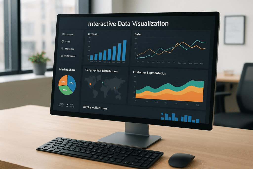
1. What Is Interactive Data Visualization?
Interactive data visualization refers to the use of advanced tools and techniques to represent data visually — such as charts, graphs, and dashboards — that users can interact with in real-time. Unlike static reports, interactive dashboards allow users to filter, drill down, and explore different perspectives of data effortlessly.
For example, with just a click, a business manager can switch from viewing overall sales performance to analyzing region-wise trends or individual product metrics. This level of interactivity enables deeper exploration and immediate insights that static charts cannot provide.
2. The Role of Graph Visualization in Understanding Relationships
Graph visualization takes data analysis to a new dimension by mapping relationships between data points. It helps users identify patterns, clusters, and connections that may not be obvious in traditional tables or spreadsheets.
Consider a company analyzing customer interactions — graph visualization can reveal how customer behaviors connect across channels, uncovering hidden influencers or dependencies. In cybersecurity, graph visualization helps track suspicious activities by mapping out connections between users, IPs, and events.
This makes it an invaluable asset across industries like finance, healthcare, logistics, and marketing.
3. Why Data Analytics and Visualization Go Hand-in-Hand
Data analytics and visualization are two sides of the same coin. While data analytics extracts insights through statistical and computational methods, data visualization translates those insights into visuals that are easy to understand.
Together, they empower organizations to:
-
Identify key performance indicators (KPIs) at a glance.
-
Spot trends and anomalies faster.
-
Communicate findings effectively across teams.
-
Make evidence-based strategic decisions.
Businesses leveraging data analytics and visualization enjoy a clear competitive advantage because they can react quickly to changes and opportunities in the market.
4. The Power of Data Analysis and Visualization Tools
Modern tools such as Power BI, Tableau, and Google Data Studio have revolutionized how organizations approach data analysis and visualization. These platforms offer intuitive drag-and-drop features, AI-powered insights, and seamless data integration from multiple sources.
At Knowledge Excel, we specialize in helping businesses design and deploy custom dashboards that integrate diverse datasets into one unified visualization layer. Whether you’re tracking financial performance, sales trends, or operational efficiency — a well-structured dashboard offers clarity and control like never before.
5. Building a Data Visualization Dashboard That Works
A data visualization dashboard is more than just a collection of charts — it’s a strategic tool that consolidates KPIs, metrics, and real-time analytics into one central view.
Here are a few best practices for building an impactful dashboard:
-
Define clear objectives: Identify what business questions your dashboard should answer.
-
Keep it simple and intuitive: Avoid clutter. Focus on key metrics that matter.
-
Choose the right visuals: Use charts, graphs, and maps that best represent your data type.
-
Ensure interactivity: Allow filtering, drill-downs, and comparisons.
-
Maintain real-time updates: Enable data refreshes to reflect the most recent information.
An effective dashboard doesn’t just display data — it drives business performance by empowering users to act on insights immediately.
6. The Business Impact of Interactive Dashboards
Organizations that adopt interactive dashboards witness measurable improvements in decision-making and operational efficiency. They can monitor goals, identify deviations early, and respond proactively.
For instance, a finance team can visualize expenses, revenue, and profitability trends in real time, while a marketing team can track campaign ROI and customer engagement patterns. Across departments, data visualization bridges the gap between analysis and action.
7. The Future of Visualization: AI, Automation & Predictive Insights
As technology advances, data visualization is evolving with AI-powered analytics, predictive modeling, and natural language queries. Soon, users won’t just view data — they’ll interact with it through voice commands or automated insights.
This next generation of visualization will help businesses anticipate trends, forecast performance, and make proactive decisions.
At Knowledge Excel, we are committed to staying ahead of this curve by providing innovative visualization solutions that help businesses not only interpret their data but predict what’s coming next.
Conclusion
In an era where data drives every decision, interactive data visualization is no longer optional — it’s essential. By combining data analytics, graph visualization, and dynamic dashboards, organizations can unlock a deeper understanding of their business landscape.
Whether you’re a startup or an enterprise, investing in powerful data visualization dashboards will transform the way you view, analyze, and act on your data.
At Knowledge Excel, we help businesses harness the true potential of data visualization to drive measurable growth and smarter decisions.